
The Numbers
The numbers were pretty clear. Hundreds of people a day were landing on the Motific marketing page. Signups were single digits. Activation was zero. I was working with the data team and we could see where people were dropping off. Amplitude tracked the funnel, LogRocket caught the hesitation. No amount of optimization was moving the needle in any meaningful way.
I was sending out a weekly growth report to the broader team: a table, a chart, some commentary, maybe a little joke to keep people engaged. But the data was not getting laughs.
The Bet
Motific was an AI chatbot management platform built by a small engineering team within Cisco's emerging technology group. The core idea was great: give technical leaders a way to configure their own AI chatbots, choose the models, define the rules, build the RAG knowledge base they pulled from. The scrappy engineering team had built the whole thing, including a polished UI. It was nice work.
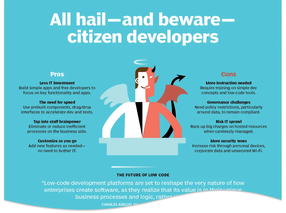
Leadership had identified a persona they were convinced would be their buyer. The citizen developer, a term Gartner coined around 2009 to describe non-IT business professionals who build applications using low-code platforms, had become a buzzword with some … buzz. Leadership adopted it as the product's target user, and the team rallied around it. We were talking about it on stage at conferences. This bet was public.
Building the Machine
Fresh off of another project, I came in as the growth design lead, running a two-person team: me plus one content designer. Together we owned acquisition and onboarding. Before designing anything, we ran through the first-time experience repeatedly, noting broken paths, plot holes, and inconsistencies. The end-to-end journey began to take shape.

Screen Flow
In Figma I mapped the full screen flow end-to-end, sectioning screens into functional teams: marketing > authentication > product > email drip campaign. Getting stakeholders in each team to agree on the shape of the journey was easy once I had a visuals to talk to. Many cross-functional meetings later, we had a pretty seamless onboarding experience.

Three Experiments
Aside from addressing the usual rough edges and messaging inconsistencies, the journey mapping pointed to three specific drop-off moments, and I designed experiments for each one, all running simultaneously.
A free trial banner addressed commitment anxiety. A countdown from 30 days sat at the top of the product, with a direct contact CTA. The message: you have time, and there's a human on the other end.
The sandbox test drive addressed time to value. This concept needed a safe place to explore before anyone would commit. A sandbox environment had been started as an engineering tool. I designed a productized version in Figma and worked with the developer to build it on top of the actual product codebase. The content designer on my team refined the language at each step. We added prominent banners in the main product body and a matching CTA on the marketing page to lead users there. The flow was instrumented with the data team, so sales got a list of named prospects (the sandbox was gated behind an email wall).
The choose your own adventure cards addressed orientation. Just below the sandbox banner, three CTAs gave users a clear first move: connect models, create a policy, or provision a motif. The three core levers of the product, surfaced immediately rather than buried in onboarding.

The Funnel Got Cleaner, not the Numbers
When we soft-launched at an industry conference, the Motific booth had a draw: a custom t-shirt printer that let visitors design their own t-shirts!
The lines were deep. The team worked the crowd, generated leads, and got people curious. The marketing page traffic reflected it but the signups did not.
We took what we heard at the booth seriously. We reworked marketing copy, refined the flow, adjusted what value we surfaced on the main page of the app, and tightened the trial conditions and language. Still not a lot of movement. That's when we started asking: what if the problem isn't the funnel?

Two Research Tracks
So I ran two research tracks, structured as a hybrid: secondary research to establish baseline context, primary research to fill the gaps with firsthand data.
The secondary research track brought in an outside UX firm I had been working with (and TBH I had some excess budget left over) to map how enterprise organizations actually buy AI tools. Their buyer journey research covered six phases from need recognition to post-purchase evaluation and identified the full cast of stakeholders at each stage. What it revealed: the buying process for enterprise AI isn't driven by one empowered individual doing an end-run around IT. It's a committee. Business unit leads, executive sponsors, IT, security, legal, finance. All of them involved, most of them skeptical, all of them asking for proof of ROI before anyone signs anything.
The primary research track put my Figma prototype directly in front of senior executives, sourced through a professional research panel. These were the exact people leadership had in mind: tech-savvy leaders who had reason to care about how their organizations deployed AI. I attended the sessions personally, jumping in when it was time to run through the prototype (eventually moderating full sessions myself when everyone else got fatigued). They understood the product. They just didn't care. Not confused, not resistant. Indifferent. The problem Motific solved wasn't one they felt yet.
Together, the two tracks told the same story. Motific had been designed for a product-led, bottom-up, self-serve adoption motion: the kind where one empowered individual discovers a tool, solves their problem, and eventually pulls the whole organization along.
But the self-serve AI tools space just wasn't there yet. Enterprise buyers wanted sales teams, security reviews, proof of ROI, and executive sponsorship. Those are opposite go-to-market strategies. And the market, two years ago, wasn't ready for either.

Mixed Results. Clear Signal.
The work we shipped produced real data. Sandbox completion hit 72%. Of users who started a trial, 32% migrated to the sandbox, a strong signal that reducing the barrier to value was the right direction. A survey we embedded returned a 0% response rate, which was a design miss but a useful one.
More importantly, the data told a strategic story. Our leader had publicly committed to the citizen developer narrative. Engineering had built something genuinely valuable. Everyone believed in it. Over the next few weeks, we made the call anyway. It was two months from soft launch to project close.
A product can feel like your baby. Stopping feels like failure. The instinct is to keep going, find a workaround, or wait for the market to catch up.
But shipping to a user who doesn't exist yet isn't persistence. It's avoidance. The most important thing design research can do isn't validate your assumptions. It's giving you permission to change course before the cost of being wrong ratchets higher.
Motific wasn't a failure. It was a fast, clean kill. Harder to do than it sounds.